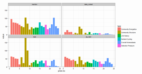
 Fig. 1. The first graphical attempt: a multi-panel plot that shows counts of prediction mentions based on four recognition categories. It is difficult to make comparisons across recognition types within a specific prediction. Fig. 1. The first graphical attempt: a multi-panel plot that shows counts of prediction mentions based on four recognition categories. It is difficult to make comparisons across recognition types within a specific prediction. I learned yesterday that creating fill textures in bar charts in ggplot is not easy. Yes, there is a clever hack (posted here on SO), but it takes a lot of coding. Why does this matter? Well, yesterday, I wanted to create a bar chart that conveyed three pieces of information: (1) the number of times predictions from a paper had been tested in the literature, (2) the type or category of each prediction (“Category”), and (3) the way in which each prediction had been dealt with in the paper (e.g., accepted as fact vs. tested empirically; “Recognition”). (Here is a bit of background about the project). And, I wanted to use code that I could interpret a few months down the line. To begin, I created a multi-panel plot (Figure 1) using the facet_wrap() option in ggplot. This figure is fine (and perhaps clearer than the final result), but my co-authors challenged me to condense this information into a single plot. I envisioned a stacked bar chart. As in Figure 1, "Category" would dictate the color of each bar. Then, each bar would have an overlain fill text (like this) depending on the variable “Recognition.” This is when I discovered that creating fill textures in ggplot is not easy. My solution? Shading! In ggplot, “alpha” can be set as an aesthetic – therefore, its value can be controlled by a variable (in my case, “Recognition”). And, just as you can control the aesthetic parameters of fill colors, outlines, etc, in your plot, so can you control the aesthetic parameters of your shading. The final result is below (Fig. 2). 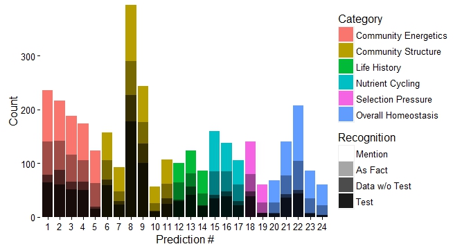 Fig. 2. Stacked bar chart using shading to differentiate "Recognition" category while maintaining color scheme of the "Category" to which each prediction belongs. Here is the code for the graph: plot.2 <- ggplot(newdata, aes(x=factor(pred.no), y=value)) + geom_bar(stat="identity", aes(fill=type)) + # Sets information for variable 1: "Category" scale_fill_discrete(name="Category", breaks=c("Community Energetics", "Community Structure", "Life History", "Nutrient Cycling", "Selection Pressure", "Overall Homeostasis")) + # Order of "Category" in legend geom_bar(stat="identity", fill="black", aes(alpha=variable)) + # Sets information for variable 2: "Recognition" scale_alpha_manual(values=c(0.9,0.7,0.35,0), name="Recognition", breaks=c("mention", "as_fact", "data_notest", "test"), # can use to set order labels=c("Mention", "As Fact", "Data w/o Test", "Test")) + theme_classic(16) + scale_y_continuous(expand = c(0,0)) + # Bars flush with x-axis xlab("Prediction #") + ylab("Count") plot.2 + theme(legend.key=element_rect(color="#EEEEEE")) # Light grey box around legend keys
3 Comments
Peter
8/13/2016 06:41:50 am
Hi, great example. Could you also publish the data (or mock data) to make it more easy to comprehend the what's happening?
Jess
9/2/2016 09:13:18 am
Hi Peter! My co-authors and I are planning to submit the paper really soon, so data is almost ready to be published. We'll be publishing the full code with it, but you can see a working version of it here: https://github.com/lgherard/Odum
Nicolás
5/22/2019 09:09:55 pm
Thank you so much!!! It was really helpful! Leave a Reply. |
Archives
July 2018
Categories |
 RSS Feed
