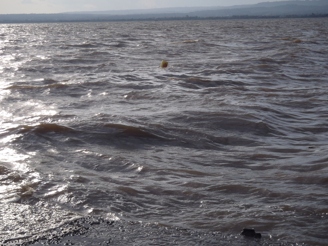
 Firework image from https://www.flickr.com/photos/epicfireworks/8058678846 The talk around Lincoln, Nebraska, is all about the fireworks. It’s the 4thof July; a brief 48-hr period in which anyone can shoot off spinners, fountains, and other displays of burning light. And, as a state, we rival any state in how much we spend on this novelty. Clearly, Nebraskans love fireworks. But, there is growing concern beyond our borders as to how all of this sound effects dogs and wildlife and the environment. As a limnologist, I immediately think about lakes. In any given town or city, firework displays are iconic over the water: lakes and rivers reflect the exploding light, increasing the brilliance of any display. But, what happens when the ash and materials fall below – into those waters?
Fireworks contain various chemicals, including heavy metals, nitrates, and phosphorus, that, when burned, give them their spectacular colors. Fireworks also often contain perchlorate, a chemical used to fuel the pyrotechnical display, but one that can also lead to thyroid issues in humans at high doses. Should we worry about all of these chemicals ending up in lakes after firework displays? Some in Michigan, New Hampshire, and New York think so. Indeed, the few studies that have been done show discernible changes in lake chemistry, particularly perchlorate, following these independence displays. In one of the most cited studies, researchers in Oklahoma found dramatic increases – 1000x – of perchlorate in Wintersmith Lake following the firework display. Increases were temporary, returning to normal levels within a few months. A similar study in Washington found 10 – 60 x increases in the concentration of perchlorate in the study lakes after July 4th. Sampling on Lake Tahoe following firework displays found evidence for increases of both perchlorate and nitrate.* Other institutions are taking notice. The New Hampshire Department of Environmental Services has released guidance on using fireworks near lakes. Disneyland, known for its almost daily firework show, has gone so far as to develop an alternative “air-launch tubes” to get the fireworks launched in the sky that are not so reliant on potential harmful chemicals. The biggest firework display in Lincoln happened last night at Oak Lake. Should Nebraska be concerned about what this did to the lake? And, is everyone paying enough attention to the diversity of chemicals that may be released in the lakes following a fireworks display? More and broader studies, like the ones mentioned above, could help answer these questions. *The situation in Lake Tahoe and fireworks has been the subject of at least one lawsuit: http://tahoequarterly.com/environment/fury-over-fourth-of-july-fireworks
1 Comment
If you know Madison, you know it is a great place to bicycle. This was fortunate for me as a very convincing person suggested I ride in RAW this past summer. To train for this 175-mile ride across the state, I rode around Madison. A lot. And, I used Strava to track my routes. So, now, I have quite a bit of information about where I’ve been cycling.
If you are a Strava premium member, they will make a map of the places you have ridden. I am not, but I am pretty good at parsing code together to do my bidding in R. Thanks in large part to Visual Cinnamon for posting code on visualizing running paths (http://www.visualcinnamon.com/2014/03/running-paths-in-amsterdam-step-2.html), I was able to make my own map of biking routes in Madison. The steps I used are below: Step 1. Get your GPX files from Strava. There’s a great article in Strava about how to export your data here. In short, you request your data from your profile and Strava will send you an email with a link to download all of the files (one file per route). Step 2. Import the GPX files to R. Importing spatial data into R can be tricky and, like Visual Cinnamon, I could not just use readGPX() to import my Strava GPX files. But, the code modification was minimal. Here is customization that ended up working to read in the Strava GPX files:
Step 3. Make a data frame with route index, latitude, and longitude.
Now that R has read the GPX files, you need to compile these files into a data frame with the spatial information. See http://www.visualcinnamon.com/2014/03/running-paths-in-amsterdam-step-2.html for the code. Step 4. Plot! There are many geographical mapping options in R, but I tend to use ggmap (created by David Kahle, https://github.com/dkahle/ggmap ). Here’s the final result: 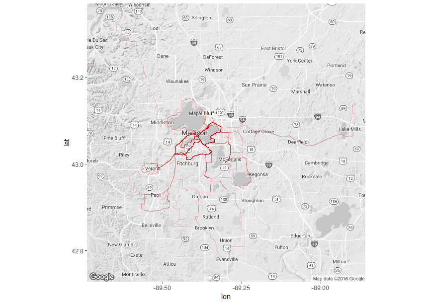
Figure 1. Heat map of bike routes I used in 2016 in and around Madison, WI, USA.
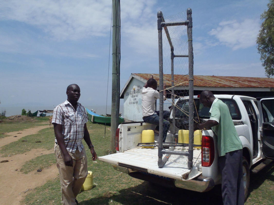
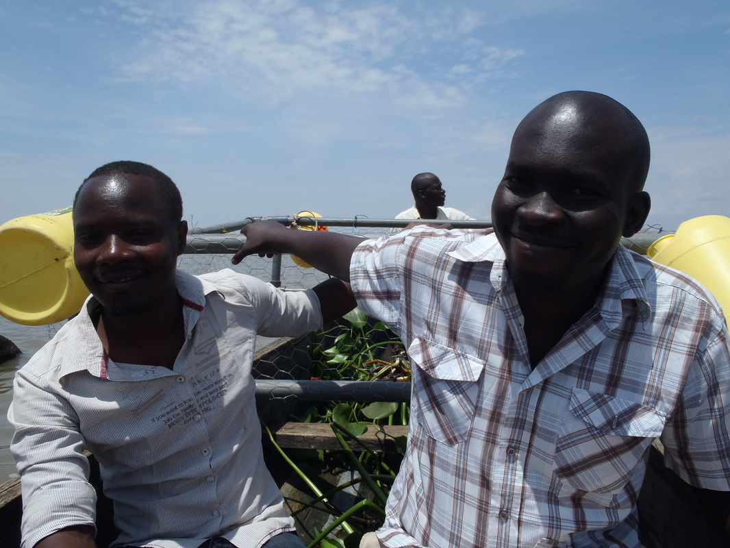
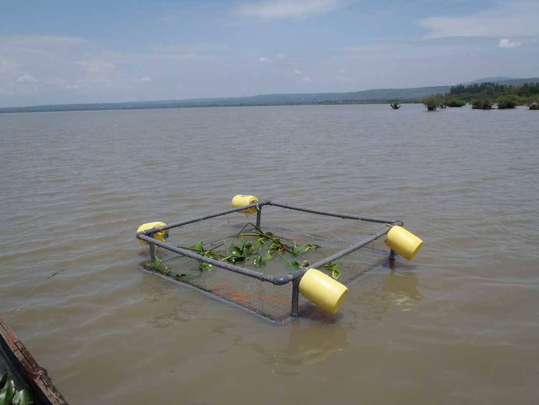
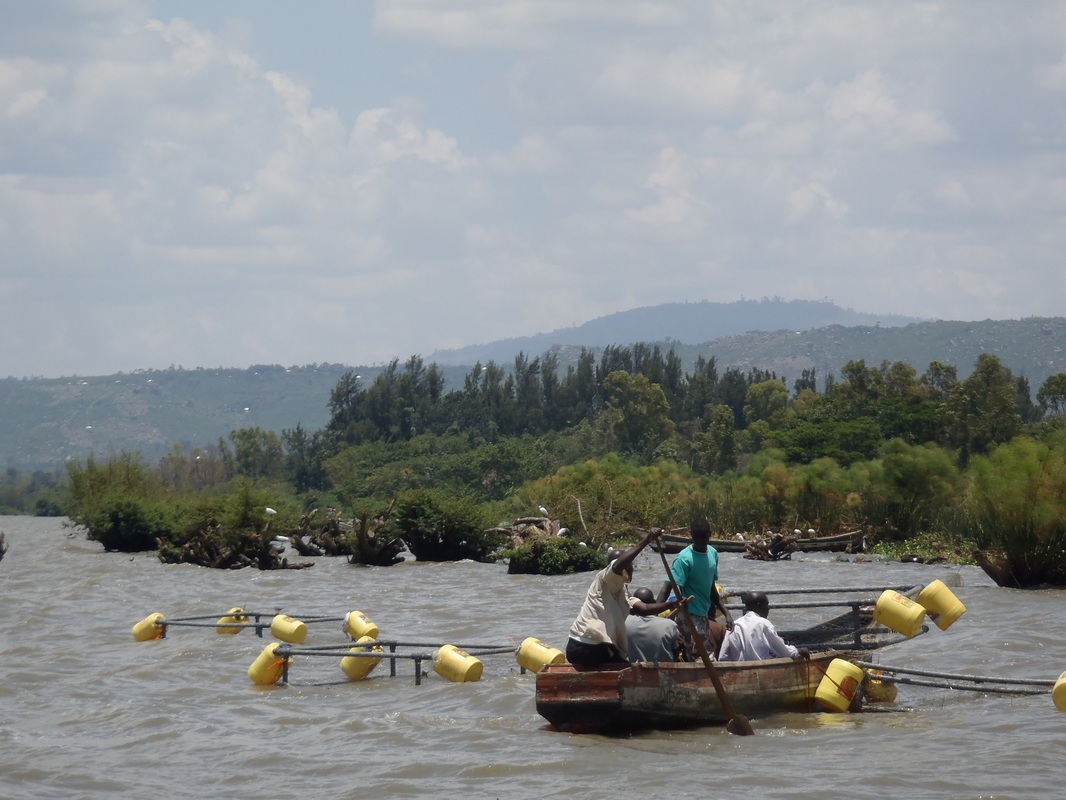
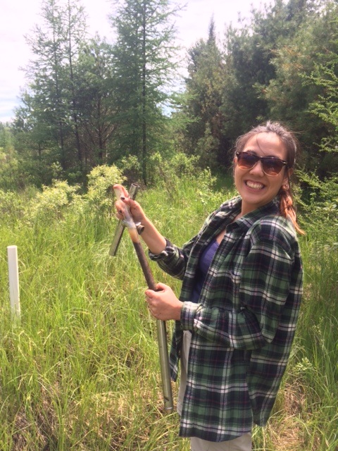
(An aside: If you are actually training for RAW, don’t just ride around Madison. Get thee out to the Driftless. You will thank yourself when you’re leaving Dubuque on ride day). And here is the complete code: A few months ago, a colleague and I received an award from UW’s Global Health Initiative to investigate how water hyacinth effects water quality in Lake Victoria and how communities around Lake Victoria interact with the lake. I am pretty excited to be starting the project, not just because it gives us the chance to uniquely answer questions at the intersection of ecology and human health, but also because it means a return to East Africa. As an undergraduate, I was lucky enough to be involved with the Nyanza Project on Lake Tanganyika, Tanzania. The undergraduate research experience instilled in me a curiosity about tropical lake limnology, one that I continues with this project. Amber and I are in the middle of our first expedition to Lake Victoria. We are being hosted by Dr. Christopher Aura and the very accommodating staff at the Kenyan Marine Fisheries Research Institute in Kisumu, Kenya. It’s been a busy week thus far: we have partnered with one of the beach communities nearby to host our in situ water hyacinth experiment, we have deployed said experiment, and we have met with lots of researchers and students both within KMFRI and the Kenyan Medical Research Institute (KMRI). Photos (L to R): (1, 2) Zachary Ogari led the transport and deployment of (3) our first experimental enclosure (Usoma Beach, Lake Victoria). Unfortunately, some leaks and the waves of Lake Victoria meant that it did not stay afloat for long. Photos (L to R): (1) A single, floating jug was the only part of our initial cage that stayed afloat in the first 24 hours. (2) However, after some modifications (mainly, preventing leaks!), we successfully launched all four enclosures and (3) added the water hyacinth.
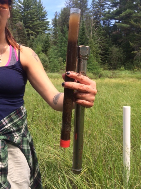
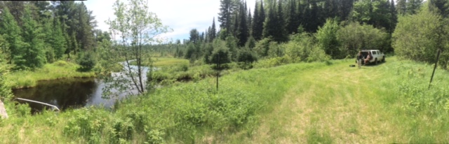
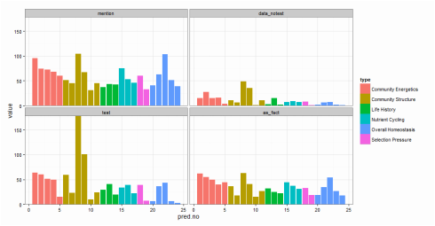 Fig. 1. The first graphical attempt: a multi-panel plot that shows counts of prediction mentions based on four recognition categories. It is difficult to make comparisons across recognition types within a specific prediction. Fig. 1. The first graphical attempt: a multi-panel plot that shows counts of prediction mentions based on four recognition categories. It is difficult to make comparisons across recognition types within a specific prediction. I learned yesterday that creating fill textures in bar charts in ggplot is not easy. Yes, there is a clever hack (posted here on SO), but it takes a lot of coding. Why does this matter? Well, yesterday, I wanted to create a bar chart that conveyed three pieces of information: (1) the number of times predictions from a paper had been tested in the literature, (2) the type or category of each prediction (“Category”), and (3) the way in which each prediction had been dealt with in the paper (e.g., accepted as fact vs. tested empirically; “Recognition”). (Here is a bit of background about the project). And, I wanted to use code that I could interpret a few months down the line. To begin, I created a multi-panel plot (Figure 1) using the facet_wrap() option in ggplot. This figure is fine (and perhaps clearer than the final result), but my co-authors challenged me to condense this information into a single plot. I envisioned a stacked bar chart. As in Figure 1, "Category" would dictate the color of each bar. Then, each bar would have an overlain fill text (like this) depending on the variable “Recognition.” This is when I discovered that creating fill textures in ggplot is not easy. My solution? Shading! In ggplot, “alpha” can be set as an aesthetic – therefore, its value can be controlled by a variable (in my case, “Recognition”). And, just as you can control the aesthetic parameters of fill colors, outlines, etc, in your plot, so can you control the aesthetic parameters of your shading. The final result is below (Fig. 2). 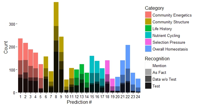 Fig. 2. Stacked bar chart using shading to differentiate "Recognition" category while maintaining color scheme of the "Category" to which each prediction belongs. Here is the code for the graph: plot.2 <- ggplot(newdata, aes(x=factor(pred.no), y=value)) + geom_bar(stat="identity", aes(fill=type)) + # Sets information for variable 1: "Category" scale_fill_discrete(name="Category", breaks=c("Community Energetics", "Community Structure", "Life History", "Nutrient Cycling", "Selection Pressure", "Overall Homeostasis")) + # Order of "Category" in legend geom_bar(stat="identity", fill="black", aes(alpha=variable)) + # Sets information for variable 2: "Recognition" scale_alpha_manual(values=c(0.9,0.7,0.35,0), name="Recognition", breaks=c("mention", "as_fact", "data_notest", "test"), # can use to set order labels=c("Mention", "As Fact", "Data w/o Test", "Test")) + theme_classic(16) + scale_y_continuous(expand = c(0,0)) + # Bars flush with x-axis xlab("Prediction #") + ylab("Count") plot.2 + theme(legend.key=element_rect(color="#EEEEEE")) # Light grey box around legend keys Stoichiometry has been a long running theme in my research, but I have often been dissatisfied in how to graphically display information about carbon (C), nitrogen (N), and phosphorus (P) ratios. This is often done with a triplot: a three-panel graph of scatterplots of the contents of C vs. N, C vs. P, and N vs. P in insects, lakes, etc. I have certainly used this format, but it forces the viewer to integrate multiple lines of information – a task that may be particularly difficult if differences between subjects are small and spread over three different figures. Through the LiWe project, I have collected lots of information about the C, N, and P contents in the lakes and streams of Cuatro Ciénegas. Now, I wanted a new way to look at the CNP ratios across the system (but not using the dreaded triplot). Below is my (current) solution. I began with the notion that if I scaled all CNP ratios to P = 1, then I could focus on two numbers of the ratio, C:P and N:P. For example, the Redfield Ratio is 106:16:1. If a lake’s CNP ratio is the same as Redfield, it’s two descriptor numbers would be 106 (for C:P) and 16 (for N:P). Scaling the CNP ratios for all the lakes and streams in my dataset in this way would give my two values for each lake or stream – a scenario that allows the graphing of CNP ratios on a single XY scatterplot. Yay! But, the graph needed a few modifications: (1) Scaling the axes. Nutrient concentrations in the lakes and streams of Cuatro Ciénegas often have wide ranges – these ranges become even larger when ratios are calculated. Therefore, I used a log transformation on the scale of both axes to better visualize the data. (2) Relevant reference lines. Large divergences from the Redfield Ratio may suggest organisms living in that system are more likely to be N- or P-limited. Therefore, I added vertical and horizontal lines to the plot that represent the Redfield Ratio (CP = 106, NP = 16, respectively). (3) Information on nutrient concentrations. One advantage of the triplot is that it integrates information on both nutrient concentrations (“quantity”) and nutrient ratios (“quality”) in the same plot. I wanted to get at this information in my stoichiometry plot, as well, so with the aid of ggplot (yes, the graph was made in R), I was able to scale the size of each point to the concentration of P (in terms of total dissolved P). 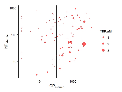 Figure 1. The carbon (C), nitrogen (N), and phosphorus (P) ratios of lakes and streams in Cuatro Ciénegas, MX. Now, when I read a paper that says “The CNP stoichiometry of the subjects changed,” I will probably visualize this graph – did the subjects move from the upper right quadrant of the graph to the bottom left quadrant (suggesting a move from a phosphorus poor to phosphorus rich environment)? Did the subjects shift from a near-Redfield stoichiometry to a non-Redfield stoichiometry? This visualization packs in a lot of information; I’d love to hear ways in which you think it is useful or ways in which it could be improved to be even more useful! And, while this graphing technique is new to me, please let me know if you’ve seen it elsewhere. One final note: You perhaps have noticed that I did not include the CN ratios. CN ratios could definitely be used on the x-axis instead of the CP ratios. But, perhaps Jim is right in saying that the CN ratios are usually pretty boring... you’ll have to look at your data and see. ;) It would perhaps seem odd to study things outside of the water when you are a limnologist. Normally, limnologists collect water or things living in the water to understand the ecology or biology of the lake or stream of interest. But, lakes and streams are influenced by the world around them, e.g., beavers that build dams that change the water flow in a stream or atmospheric deposition that increases the nutrient content of lake water. And, therefore, I find myself working with an undergraduate assistant collecting soil cores to better understand what compounds might be moving from soils into lakes. We took our first cores today from Allequash Creek, Wisconsin! Although we won't be studying the chemistry of these cores (we will be working in lakes a bit farther away from our field station home of Trout Lake), collecting them helps us practice our sampling protocol and design our experiments for the cores to be collected at the Chequamegon-Nicolet National Forest. 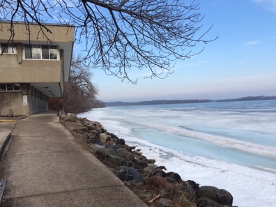
Center for Limnology on the shores of icy Lake Mendota.
This week I begin my post doc at the Center for Limnology at UW-Madison with Emily Stanley. I will also be working with Steve Sebestyen and Randy Kolka from the USFS and Nora Casson from the University of Winnipeg. We are working on a project to understand the effects of environmental change on lakes in northern Wisconsin. More details to come!
|
Archives
July 2018
Categories |

 RSS Feed
